(Click to view)
In 1929, a group of historians found an amazing map drawn on a camel skin.
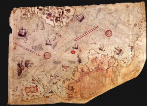
Research showed that it was a genuine document drawn in 1513 by Piri Reis, a famous admiral of the Turkish fleet in the sixteenth century.
His passion was cartography. His high rank within the Turkish navy allowed him to have a privileged access to the Imperial Library of Constantinople.
The Turkish admiral admits in a series of notes on the map that he compiled and copied the data from a large number of source maps, some of which dated back to
the fourth century BC or earlier.
It was drawn on camel skin parchment, using nine different colours of ink; it is 860 mm tall, 610 mm wide at the top (north) and 410 mm wide at the base (south). There is evidence along the top edge that another strip of parchment, which would probably have shown the British Isles, Iceland, Greenland and Newfoundland, has been lost. The eastern section of the map has also been torn away, leaving a ragged edge, although the change in width from north to south is a product of the natural shape of the skin. It is illustrated with a number of ships, most of which are Portuguese caravels, parrots (referred to as ‘tuti birds’, depicted on the island of Antilles) and mythical images. 117 place-names are shown on the map, most of which are typical of late medieval portolan charts and are easily identifiable.
Portolans developed in the late Middle Ages as mariners’ charts of the Mediterranean Sea and the Atlantic coasts of Europe, based on the use of the magnetic compass and dead reckoning to calculate longitude. As the European nations began to explore the rest of the world, so the newly acquired information was added to these types of map. Like other portolans, the surviving part of Piri Re‘is’s 1513 map has a network of lines radiating from five circular patterns of wind or compass roses; these so-called rhumb lines show various compass directions and prevailing winds. A typical feature of this sort of map is the depiction of the recently discovered New World at a larger scale than the Old World. The effect of this is to displace many coastal features farther north and south than their correct latitudes. The number of compass roses is evidence that the original map depicted the whole world as the standard portolan chart has seventeen such roses. The remaining twelve would have been on the now lost sections.
There are also thirty legends around the map, twenty-nine in Turkish and one in Arabic, the latter identifying the mapmaker and dating it. The Turkish legends give details about the people, animals, minerals and curiosities of the New World. In the Turkish legend detailing his sources, written over South America, Piri states “This section describes the way in which this map was executed. No such map existed in our time. Your humble servant is its author and brought it into being. It is based mainly on twenty charts and mappae mundi, one of which was drawn in the time of Alexander the Great, and is known to the Arabs as Caferiye. This map is the result of comparison with eight such Caferiye maps, one Arab map of India and China and also the map of the western land drawn by Columbus; such that this map of the seven seas is as accurate and reliable as the latter map of this region.” In his own words – which most Bad Archaeologists do not quote – Piri specifically denies that it is a copy of an ancient map and states that it is his own composition and, moreover, by claiming Columbus as the source for the map of the ‘western land’ (i.e. the Americas), he clearly implies that it was not present on the ancient Caferiye maps. Only Hapgood and his followers see value in this statement: Hapgood believed that Piri had miscombined several separate maps of South America and Antarctica. Only this way could he explain why Piri’s map is not an accurate depiction of these continents.
On the map, the shape and orientation of Hispaniola is similar to the depiction of Cipango (Japan) on portolans; it was one of the places Columbus had hoped to reach on his first voyage. Indeed, when he discovered Hispaniola during his first voyage, he believed that he had reached Cipango. Cuba is also shown as part of the mainland, as Columbus believed that it was a great cape projecting east from Asia (indeed, Columbus would have been astonished to learn that he had discovered a new continent, believing until his dying day that ‘New Spain’ was part of Asia). The placenames recorded by Piri on this section of the mainland derive from Columbus’s second voyage and clearly identify the land as Cuba. These points demonstrate the map’s close connection with Christopher Columbus, supporting Piri’s statement that he copied a map by him.
The claims
The suggestion that the Antarctic continent is represented on the map was first proposed by retired Captain Arlington Humphrey Mallery in 1956. He was an amateur archaeologist who believed that North America had been extensively colonised by Celts, Vikings and other Old World peoples, who possessed accurate maps lost to later ages. Tellingly, Mallery used the word ‘decipher’ to describe how he analysed and reconstructed what he believed the sixteenth- to eighteenth-century maps depicted. He thought that a combination of numerous maps was used to produce a single map, but that the later copyists did not recognise that their sources had different points of origin, different scales and different projections. It was therefore necessary to rearrange different parts of a single map to understand what the hypothesised originals had shown.
Charles Hapgood
Bizarrely, Mallery managed to influence a few other people, including several officers of the US Navy Hydrographic Office, who came forward to endorse his reconstructions. He also made a powerful impression on Charles Hapgood (1904-1982), a history of science teacher who read a transcript of a radio broadcast on Mallery’s interpretation of the Piri Re‘is map. Hapgood had developed the hypothesis of what he called earth crustal displacement during the 1950s. According to this hypothesis, the earth’s crust is poorly bonded to the underlying mantle and occasionally slips over it, causing worldwide devastation. One of the causes of these displacements is the build up of ice at the poles, which causes the crust to become top-heavy and mover towards the equator through centrifugal force. Correspondence with Albert Einstein (1879-1955) impressed the theoretical physicist so much that he wrote a foreword to Hapgood’s 1958 book Earth’s Shifting Crust. Hapgood was the first to draw wider public attention to maps, including the three discussed on this site, that he claimed showed Antarctica over three centuries before its accepted discovery in the nineteenth century. Based on aerial photographs taken by the US Air Force, Hapgood compared Piri’s map with an azimuthal equidistant projection of the world centred near Cairo.
Hapgood assumed that the original source maps, which he believed derived from an ancient survey of Antarctica at a time when it was free from ice, were extremely accurate. Because of this, he also assumed that any difference between the Piri Re‘is map and modern maps were the result of copying errors made by Piri. Starting from this position, it mattered little to Hapgood if he adjusted the scales between stretches of coastline, redrew ‘missing’ sections of coastline and altered the orientation of landmasses to ‘correct errors’ on Piri’s map to match the hypothesised source maps, a technique derived from Mallery. Hapgood found it necessary to redraw the map using four separate grids, two of which are parallel, but offset by a few degrees and drawn on different scales; a third has to be turned clockwise nearly 79 degrees from these two, while the fourth is turned counterclockwise almost 40 degrees and drawn on about half the scale of the main grid. Using this method, Hapgood identified five separate equators. To make matters worse, it is necessary to ignore the placenames that fill the map. The placenames given by Piri match those found on other maps from the early sixteenth century, many of which continue to be used to the present day.
Erich von Däniken and Charles Hapgood
In the 1960s, Hapgood’s ideas, which had not attracted much attention when first published as his arguments were complex and his results unorthodox, were popularised by a number of writers, including (most influentially) Erich von Däniken. He simply repeated Hapgood’s assertion that Piri’s map depicts an ice-free Antarctica as if a proven fact and suggested that the only explanation is that it must have been made by extraterrestrials, either at an early date when Antarctica was indeed free from ice or because their technology revealed the underlying surface. These accurate maps were later copied by Piri, via numerous intermediate copies, which introduced errors, inaccuracies and uncertainties. To von Däniken, moreover, the supposed elongation of South America was a result not of the combination of four separate maps at different scales, but of the map’s origin in satellite photography.
The placenames written on the southern landmass demonstrate that Piri took into account the commonly held belief in a southern continent. Classical Greek geographers first posited its existence, and it was reported by Portuguese explorers voyaging along the east coast of South America (some of whom may have reached the Antarctic Peninsula). Even so, the shape of the southern land piri drew in no way resembles the coast of Antarctica, ice-free or otherwise. The sole point of comparison is that both lie to the south of the Atlantic Ocean and have a generally east-west coastline. An illustration of the power of the belief in an unknown southern continent is shown by the justification for depicting one given by Gerhard Kremer (Gerhardus Mercator, 1512-1594). On his map of the world published in 1569, he wrote that if the earth were to remain in equilibrium, the land masses of the northern hemisphere must be balanced “under the Antarctic Pole [by] a continent so great that with the southern parts of Asia, and the new India or America, [it] should be a weight equal to the other lands.” Deriving as it did from Classical geographers, this viewpoint explains why so many sixteenth-century cartographers were confident enough to show a southern landmass, even without evidence for its existence from mariners.
The Art Of Maps:
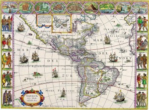
The Art of Maps: Map of America from Atlas sive Cosmographicae by Gerardus Mercator (1595)
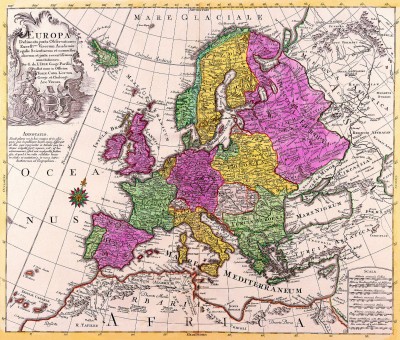
The Art of Maps: Europa Delineata juxta Obfervationes Excellorum – Vindel 1760
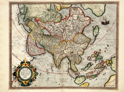
The Art of Maps: Map of Asia from Atlas sive Cosmographicae by Gerardus Mercator (1595)
The Art of Maps: Map of Europe from Atlas sive Cosmographicae by Gerardus Mercator (1595)
The Art of maps: John Speed: Asia with the Islands adioyning described, the atire of the people, & Townes of importance, all of them newly augmented . . . 1626
The Art of Maps:Johann Baptiste Homann [California as an Island]
The Art of maps:Matthias Quad – Map of North America 1593
The Art of Maps: Americae Nova Tabula
Sightseeing Map Locations Bulgaria
The Art of Maps: CORNELIS DANCKERTS Nieuw Aerdsch Pley MAP
